
 View Cart
 sales@dataq.com
 330-668-1444
Professional Instrumentation Components
Real-Time Instrumentation Components
Our Professional Components are a collection of 23 ActiveX and VCL components, with advanced features not included with our Standard Instrumentation Component Packages. The Professional Pack product includes both the Analog Components, Digital Components, Strip Chart Component, and the following 23 additional components. These components are only included in the Professional Pack Product.
Spectrum Display, Sliding Scale, Sliding Compass, Compass, Dual Compass, LED Matrix, Seven Segment SMPTE, Pie Chart,
Percent Bar, Object Canvas, Rotation Display, Log Gauge, LED Diamond, LED Arrow, Angular Log Gauge, Switch Rocker,
Switch Rocker 3-way, Switch Lever, Switch Quad, Timer, Thread Timers, Phone Pad, Keyboard, Panel
Spectrum Display
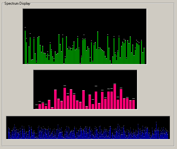
The Spectrum Display Control is a spectrum display with optional peak and peak decay support.
Use the BarCount property to set the number of bars. The BarValue property can be set independently for each bar element only at runtime.
Bar values displayed at design-time are for illustrative purposes only to aide in development of your application. You will need to use the clear method or initialize all bar elements at runtime to clear out these initial/illustrative values.
Return to XControls Instrument Pack Page or Professional Pack Page.
Sliding Scale
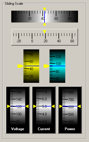
The Sliding Scale Control is a moving graphical gauge with a linear representation of the data. One static pointer refers to the position of the moving scale.
The Sliding Scale also has Shadow effects (ScaleShadowColor, ScaleShadowEnabled, ScaleBackgroundColor) that give the Sliding Scale a three dimensional look.
Return to XControls Instrument Pack Page or Professional Pack Page.
Sliding Compass
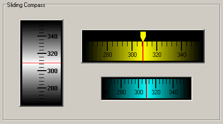
The Sliding Compass Control is a moving graphical compass with a linear and circular representation of the data (360 degree circular scale). One static pointer refers to the position of the moving scale and one dynamic pointer refers to a secondary position on the moving scale.
The Sliding Compass also has Shadow effects (ScaleShadowColor, ScaleShadowEnabled, ScaleBackgroundColor) that give the Sliding Compass a three dimensional look.
Return to XControls Instrument Pack Page or Professional Pack Page.
Compass
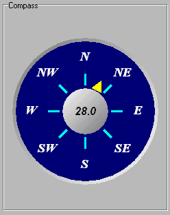
The Compass control is used to display a graphical representation of a compass. Use the Direction property to change the direction the compass is pointing to. To also show the numerical value that the compass is pointing to in the center of the control, set the ShowDirectionDisplay property to True.
Return to XControls Instrument Pack Page or Professional Pack Page.
Dual Compass
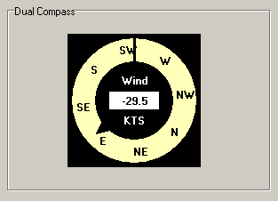
The Dual Compass Control is used to display a graphical representation of a multi-directional compass.
Use the Pointer1Position and Pointer2Position properties to change the direction the compass pointers are pointing to. One static pointer refers to the position of the moving scale and one dynamic pointer refers to a secondary position on the moving scale.
The CenterDisplayPosition is independent of the pointer position properties and allows the display of numerical values. The ShowCenterDisplay, ShowPointer1, and/or ShowPointer2 properties can be use to show or hide these displays.
Return to XControls Instrument Pack Page or Professional Pack Page.
LED Matrix
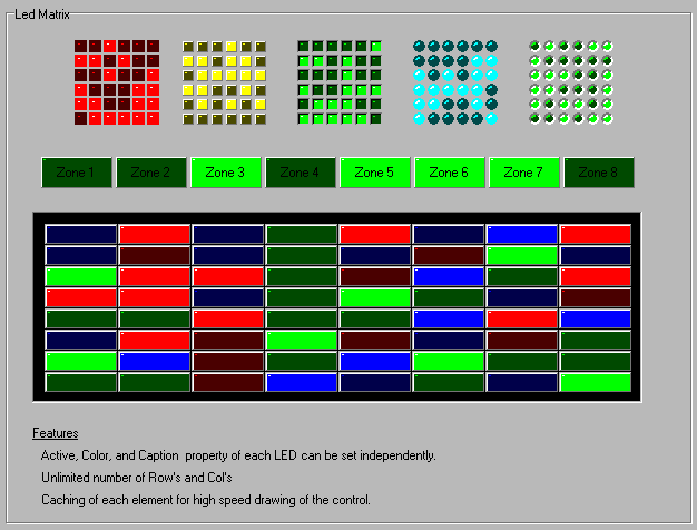
The LED Matrix is a grid of LED elements. The advantage of using the LED Matrix component instead of placing individual LED's on your development form is that only one window handle is needed for the entire control. Consequently, the painting speed is much faster that having each element paint itself.
Return to XControls Instrument Pack Page or Professional Pack Page.
Seven Segment SMPTE
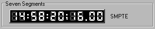
The Seven Segment SMPTE control is a variation of the Seven Segment Clock component with support for SMPTE time. SMPTE time is a Radio/Television standard for displaying Frame Rate and Field Number in addition to the time for editing of Audio/Video signals. The display is of the HH:MM:SS:FR.FD format in NonDropFrame mode and the HH:MM:SS;FR.FD format in DropFrame mode (FR = Frame : FD = Field). The time can be set with the Time property or each field can be individually set using the Hours, Minutes, and Seconds properties.
Return to XControls Instrument Pack Page or Professional Pack Page.
Pie Chart
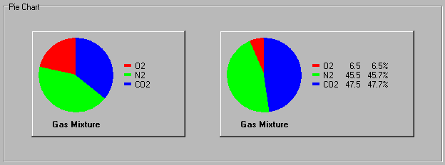
The Pie Chart control is used to display a graphical bar representation of item percentages. Use the property editor to add or remove items and change their property's at design time. At runtime, use AddItem, RemoveItem, ClearList, and ItemCount to add or remove items, and use the ItemTitle, ItemColor, and ItemValue to change the properties. The legend value and percentage columns can be individually hidden with the LegendShowValue and LegendShowPercent propertyies.
Return to XControls Instrument Pack Page or Professional Pack Page.
Percent Bar
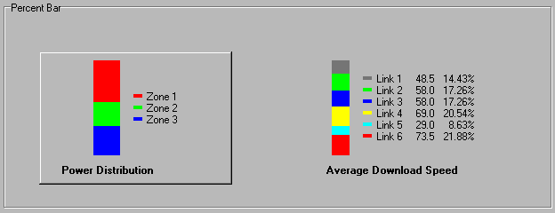
The Percent Bar control is used to display a graphical bar representation of item percentages. Use the property editor to add or remove items and change their property's at design time. At runtime, use AddItem, RemoveItem, ClearList, and ItemCount to add or remove items, and use the ItemTitle, ItemColor, and ItemValue to change the properties. The legend value and percentage columns can be individually hidden with the LegendShowValue and LegendShowPercent properties.
Return to XControls Instrument Pack Page or Professional Pack Page.
Object Canvas
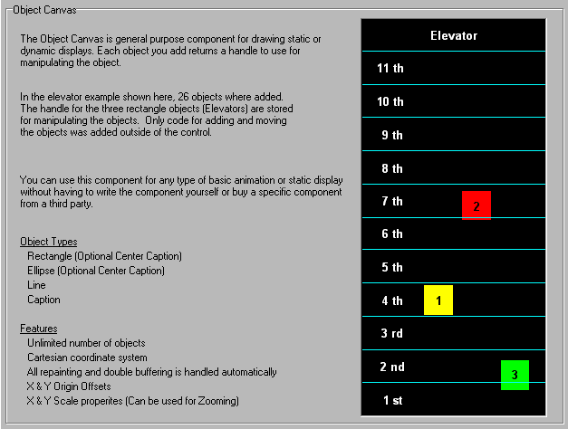
The Object Canvas control is a basic canvas with an interface for adding persistent objects at runtime (Painting Persistence Only). All painting is handled automatically and is double-buffered to prevent flickering at run-time. The coordinate system is based on the Cartesian coordinate system with (0,0) corresponding to the center of the component. The X & Y range is set using the DisplayRangeX and DisplayRangeY properties.
Four basic drawing objects can be added to the canvas (Ellipse, Rectangle, Line, Text). There is no limitation to the number or types of basic objects that can be added. When one of the basic objects is added using the AddEllipse, AddRectangle, AddLine, or AddLabel methods, all properties of the object not specified in the parameters of the add methods are set according to the Default property settings. Store the handle of the object which is returned when calling one of the four add methods if you want to manipulate the object or change its properties. Once an object is added, any property of the object can be modified using the numerous get and set methods. The object type can also be changed dynamically at runtime if desired.
The last object added will have the highest z-order and will be shown on top. To manipulate the z-order at a later time, use the BringObjectToFront and SendObjectToBack methods.
To zoom-in or zoom-out, change the DisplayRangeX and DisplayRangeY properties. Both values must be adjusted by the same percentage for proportional scaling.
To offset the drawing, use the OriginX and OriginY properties.
Use ClearList to remove all objects. Use RemoveObject to remove a single object. Use BeginUpdate and EndUpdate to improve performance when manipulating a large number of objects or to control the interval of repainting during animations.
Return to XControls Instrument Pack Page or Professional Pack Page.
Rotation Display

The Rotation Display control is used for rotating a bitmap in real-time. The lower left pixel of the bitmap is used for the transparent color. To specify the angle of rotation, set the RotationAngle property.
The performance depends on the number of rotations per second and the size of the bitmap. The performance is not impacted by the size of the control, only the portion where the bitmap is displayed is actually rotated. To increase performance, decrease the bitmap size or decrease the rate at which the RotationAngle property is changed.
Return to XControls Instrument Pack Page or Professional Pack Page.
Log Gauge
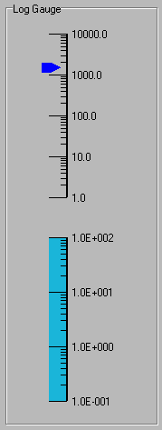
The Log Gauge control is a graphical gauge with a logarithmic scale. The major tick labels can be displayed in Scientific or Value by setting the TickLabelStyle property. The number of minor ticks is fixed at 9 for a total of 10 divisions.
Return to XControls Instrument Pack Page or Professional Pack Page.
LED Diamond
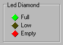
The LED Diamond Control is a diamond shaped LED with a None, Raised, or Lowered BevelStyle.
Return to XControls Instrument Pack Page or Professional Pack Page.
LED Arrow
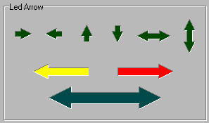
The LED Arrow control is an Arrow shaped LED with a None, Raised, or Lowered BevelStyle. Supports 6 arrow direction styles.
Return to XControls Instrument Pack Page or Professional Pack Page.
Angular Log Gauge
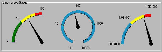
The Angular Log Gauge is a graphical gauge with an angular representation of the data using a logarithmic scale. To set or get the position use the Position property. The Major Tick labels can be displayed in Scientific or Value by setting the TickLabelStyle property. The number of minor ticks is fixed at 9 for a total of 10 divisions.
Return to XControls Instrument Pack Page or Professional Pack Page.
Switch Rocker
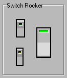
The Switch Rocker control is a binary switch with a rocker graphical representation. The control uses the space key for keyboard control.
Return to XControls Instrument Pack Page or Professional Pack Page.
Switch Rocker 3-way
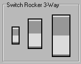
The Switch Rocker 3-way control is a momentary up and down switch. It has events and properties built to simplify the implementation of single axis control. Use the OnValueChange event to respond to changes. Use the Increment property to specify the amount the Value property is changed on each click or repeat event.
By default, the repeat feature is enabled and is configured with the RepeatInitialDelay and RepeatInterval properties. To disable the repeat feature, set RepeatInitialDelay to 0.
The control supports the Up & Down arrows keys on the keyboard for keyboard control. To disable keyboard control, set the UseArrowKeys property to False.
Return to XControls Instrument Pack Page or Professional Pack Page.
Switch Lever
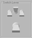
The Switch Lever control is a binary switch with a lever graphical representation. The control uses the space key for keyboard control. Use the OnChange event to respond to changes in the Active property.
Return to XControls Instrument Pack Page or Professional Pack Page.
Switch Quad
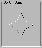
The Switch Quad control can be used for any type of 2-axis control. There are independent events for each switch.
This control has events and properties built to simplify the implementation of X-Y control. For Y-Axis control, use the OnValueYChange event along with the ValueY and IncrementY properties. For X-Axis control, use the OnValueXChange event along with the ValueX and IncrementX properties.
By default, the repeat feature is enabled and is configured with the RepeatInitialDelay and RepeatInterval properties. To disable the repeat feature, set RepeatInitialDelay to 0.
The control supports the 4 arrows keys on the keyboard for keyboard control. To disable keyboard control, set the UseArrowKeys property to False.
Return to XControls Instrument Pack Page or Professional Pack Page.
Timer (9 independent)

The Timer Control encapsulates 9 Windows API timers. Each timer has its own OnTimer event and Interval and Enabled properties. Each timer is independent and not synchronized. The accuracy of each timer is dependent on the operating system and the amount of operating system activity. The Windows API considers the timer events to be the lowest priority message in the system and should not be relied upon to provide consistent or accurate timing. Normally an API timer is used for none critical task or animation timers.
This component is invaluable when distributing your software on platforms where the version of standard Windows timer control is not know (ActiveX users). Also, you reduce clutter on your form with fewer non-visible components taking up space.
Return to XControls Instrument Pack Page or Professional Pack Page.
Thread Timers (9 independent)

The Thread Timers Control encapsulates 9 Multi-Threaded timers. Each timer has its own OnTimer event, Interval, Enabled, and Thread Priority properties. Each timer is independent and not synchronized. The accuracy of each timer is dependent on the operating system and the amount of operating system activity. The Thread Timers differ from the Timer component in that they do not use low priority Windows Timer message, but use threads whose priority can be configured. This allows you to ensure that timer events fire consistently.
Return to XControls Instrument Pack Page or Professional Pack Page.
Phone Pad
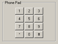
The Phone Pad Control is a simple numeric keypad control with mouse control support.
Input is processed in your application by using the OnKeyClick event.
Return to XControls Instrument Pack Page or Professional Pack Page.
Keyboard
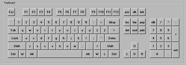
The Keyboard Control is an on-screen keyboard with mouse control support and is specifically designed for touch-screen applications or keyboard-less applications. The keyboard will automatically send key-clicks to the last windowed control (referred to here as the focus control) that had focus prior to the keyboard being clicked. This focus control will accept all keyboard input generated by the keyboard component.
Keyboard Doesn't Take Focus Method
This method is for applications where the focus control and keyboard component are on the same form. If the keyboard component is on the same form as the focus control, set the FocusStyle property to ikfsBlockFocus. The keyboard will automatically ensure that it doesn't take focus when clicked.
Take Focus and Reset Focus Method
This method is for applications where the focus control and keyboard component are on different forms. If the keyboard component is on a different form than the focus control, set the FocusStyle property to ikfsRerouteFocus. The keyboard will take focus when clicked, and will then automatically switch back focus to the focus control.
The drawback to this method is that if the focus control is designed to "Select All" text on exit (such as a combo box or some text boxes), you may run into problem a problem where the focus control re-takes focus, selects all text, accepts the key-click, and erases all text in the control.
Note: currently, the keyboard will only function with windowed controls within the same process or application.
Return to XControls Instrument Pack Page or Professional Pack Page.
Panel
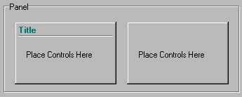
The Panel control is a basic panel that can have child controls embedded within it.
Return to XControls Instrument Pack Page or Professional Pack Page.